Session 5: Graphics session
A picture is worth a thousand words.
Especially when your data is big. We’ll try to show you one of the easiest ways to get nice pictures from your unix. We’ll be using R, but we’re not trying to teach you R. There is a lot of packages in R Project, and most of them are not that godo. We tried to cherry pick the best bits;)
Summarization
R is best for working with ‘tables’. That means data, where each line contains
the same amount of ‘fields’, delimited by some special character like ; or
\t (tab character). The first row can contain column names. VCF is almost a
nice tabular file. The delimiter is \t, but there is some mess in the
beginning of the file:
</data-shared/mus_mda/00-popdata/popdata_mda.vcf.gz zcat | less -S
Prepare the input file
Our input dataset is huge, and we want to use only some subset of the animals.
Let’s choose few european individuals. They have RDS, KCT, MWN and
BAG in their names. Each programmer is lazy and prefers to avoid mistakes
by letting the machine do the work - let’s find the column numbers with unix
tools.
# we'll be reusing the same long file name, store it into a variable
IN=/data-shared/mus_mda/00-popdata/popdata_mda.vcf.gz

# create a new 'project' directory in data
mkdir -p ~/projects/plotvcf/data
cd ~/projects/plotvcf

# check the file once again, and find the obligatory VCF columns
<$IN zcat | less -S

# let the computer number the colums (colnames)
<$IN zcat |
  grep -v '^##' |
  head -1 |
  tr "\t" "\n" |
  nl |
  less

# the obligatory columns are 1-9

# now find the sample columns according to the pattern
<$IN zcat |
  grep -v '^##' |
  head -1 |
  tr "\t" "\n" |
  nl |
  grep -e RDS -e KCT -e MWN -e BAG |
  awk '{print $1}' |
  paste -sd,

# it's 67,68,69,70,71,72,73,74,75,76,77,78,79,80,81,82,83,84,85

# now decompress with zcat and subset the data with cut
<$IN zcat |
  cut -f1-9,67-85 \
> data/popdata_mda_euro.vcf
We want to get rid of the comment lines starting with ##, and keep the
line starting with # as column names (getting rid of the # itself):
IN=data/popdata_mda_euro.vcf

# get rid of the '##' lines (quotes have to be there, otherwise
# '#' means a comment in bash)
<$IN grep -v '##' | less -S

# better formatted output
<$IN grep -v '##' | column -t | less -S

# it takes too much time, probably column -t is reading too much of the file
# we're good with first 1000 lines
<$IN grep -v '##' | head -1000 | column -t | less -S

# good, now trim the first #
<$IN grep -v '##' | tail -c +2 | less -S

# all looks ok, store it (tsv for tab separated values)
# skip the very first character with tail
<$IN grep -v '##' | tail -c +2 > data/popdata_mda_euro.tsv
What have we learned?
unix tools excell at handling very large unstructured data
R is awesome at visualizatoin, but it needs smaller, tabular data
to get the best from both worlds, use unix tools to preprocess data for R
column -tcan be used to preview tabular data in unix
Visualize data in RStudio
Just click this link (ctrl-click to keep this manual open): Open RStudio.
In R Studio choose . Locate your
project folder plotvcf in the dialog. Then
. R has it’s own working
directory, opening/creating a project will set it automatically for you.
Load and check the input
We’ll be using a specifc subset of R known as Tidyverse:
library(tidyverse)
Note
You can run the command by placing your caret in it and pressing ctrl+enter.
Now press ctrl+s, and save your script as plots.R. It is a better
practice to write all your commands in the script window, and execute with
ctrl+enter. You can comment them easily, you’ll find them faster than in
.Rhistory.
Tabular data is loaded by read_tsv. On a new line,
type read_tsv and press F1. Help should pop up:
read_tsv('data/popdata_mda_euro.tsv') -> d
A new entry should show up in the ‘Environment’ tab. Click the arrow and
explore. Also click the d letter itself.
You can see that CHROM was encoded as a number only and it was loaded as
integer. But in fact it is a factor, not a number (remember e.g.
chromosome X). Fix this in the mutate command, loading the data again
and overwriting d. The (smart) plotting would not work well otherwise:
read_tsv('data/popdata_mda_euro.tsv') %>%
  mutate(CHROM = as.factor(CHROM)) ->
  d
First plot
We will use the ggplot2 library. The ‘grammatical’ structure of the
command says what to plot, and how to represent the values. Usually the
ggplot command contains the reference to the data, and graphic elements
are added with + geom_..(). There are even some sensible defaults - e.g.
geom_bar of a factor sums the observations for each level of the factor:
ggplot(d, aes(CHROM)) + geom_bar()
This shows the number of variants in each chromosome. You can see here, that we’ve included only a subset of the data, comprising chromosomes 2 and 11.
Summarize the data
We’re interested in variant density along the chromosomes. We can simply break the chromosome into equal sized chunks, and count variants in each of them as a measure of density.
There is a function round_any in the package plyr, which given
precision rounds the numbers. We will use it to round the variant position to
1x10^6 (million base pairs), and then use this rounded position as the block
identifier. Because the same positions repeat on each chromosome, we need to
calculate it once per each chromosome. This is guaranteed by group_by.
mutate just adds a column to the data.
You’re already used to pipes from the previous exercises. While it’s not
common in R, it is possible to build your commands in a similar way thanks to
the magrittr package. The name of the package is an homage to the Belgian
surrealist René Magritte and his most popular painting.
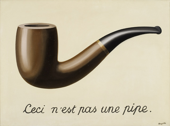
Ceci n’est pas une pipe. This is not a pipe.
Although the magrittr %>% operator is not a pipe, it behaves like one. You
can chain your commands like when building a bash pipeline:
# 'bash-like' ordering (source data -> operations -> output)
d %>%
  group_by(CHROM) %>%
  mutate(POS_block = plyr::round_any(POS, 1e6)) ->
  dc

# the above command is equivalent to
dc <- mutate(group_by(d, CHROM), POS_block = plyr::round_any(POS, 1e6))
Now you can check how the round_any processed the POS value. Click the
dc in the Environment tab and look for POS_block. Looks good, we can go on.
The next transformation is to count variants (table rows) in each block (per chromosome):
You can use View in R Studio instead of less in bash.
dc %>%
 group_by(CHROM, POS_block) %>%
 summarise(nvars = n()) %>%
 View
Note
To run the whole block at once with ctrl+enter, select it before you press the shortcut.
If the data look like you expected, you can go on to plotting:
dc %>%
  group_by(CHROM, POS_block) %>%
  summarise(nvars = n()) %>%
  ggplot(aes(POS_block, nvars)) +
    geom_line() +
    facet_wrap(~CHROM, ncol = 1)
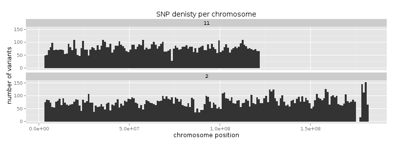
Now you can improve your plot by making the labels more comprehensible:
dc %>%
  group_by(CHROM, POS_block) %>%
  summarise(nvars=n()) %>%
  ggplot(aes(POS_block, nvars)) +
    geom_line() +
    facet_wrap(~CHROM, ncol = 1) +
    ggtitle("SNP denisty per chromosome") +
    ylab("number of variants") +
    xlab("chromosome position")
If you prefer bars instead of a connected line, it’s an easy swap with ggplot.
dc %>%
  group_by(CHROM, POS_block) %>%
  summarise(nvars = n()) %>%
  ggplot(aes(POS_block, nvars)) +
    geom_col() +
    facet_wrap(~CHROM, ncol = 1) +
    ggtitle("SNP denisty per chromosome") +
    ylab("number of variants") +
    xlab("chromosome position")
This could have saved us some more typing:
ggplot(d, aes(POS)) +
  geom_histogram() +
  facet_wrap(~CHROM, ncol = 1) +
  ggtitle("SNP denisty per chromosome") +
  ylab("number of variants") +
  xlab("chromosome position")
ggplot warned you in the Console:
stat_bin: binwidth defaulted to range/30. Use 'binwidth = x' to adjust this.
You can use binwidth to adjust the width of the bars, setting it to 1x10^6
again:
ggplot(d, aes(POS)) +
  geom_histogram(binwidth=1e6) +
  facet_wrap(~CHROM, ncol = 1) +
  ggtitle("SNP denisty per chromosome") +
  ylab("number of variants") +
  xlab("chromosome position")
What have we learned?
there is a nice way to produce graphics directly on the remote machine
it’s easy to visualize data when you prepare the right inputs ;)
you can use the ‘pipe ordering’ of commands familiar from unix also in R
Tidy data
To create plots in such a smooth way like in the previous example the data has to loosely conform to some simple rules. In short - each column is a variable, each row is an observation. You can find more details in the Tidy data paper.
The vcf as is can be considered tidy when using the CHROM and POS
columns. Each variant (SNP) is a row. The data is not tidy when using variants
in particular individuals. All individual identifiers should be in single
column (variable), but there are several columns with individual names. This
is not ‘wrong’ per se, this format is more concise. But it does not work well
with ggplot.
Now if we want to look at genotypes per individual, we need the genotype as a
single variable, not 18. pivot_longer takes the values from multiple columns
and gathers them into one column. It creates another column where it stores
the originating column name for each value.
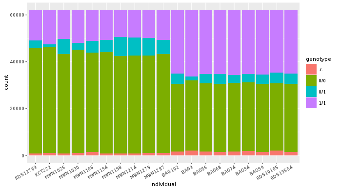
d %>%
  pivot_longer(10:28, names_to = "individual", values_to = "genotype") ->
  dm
Look at the data. Now we can plot the counts of reference/heterozygous/alternative alleles easily.
ggplot(dm, aes(individual, fill = genotype)) + geom_bar()
Again, most of the code is (usually) spent on trying to make the plot look better:
ggplot(dm, aes(individual, fill = genotype)) +
  geom_bar() +
  theme(axis.text.x = element_text(angle = 30, hjust = 1))
Now try to change parts of the command to see the effect of various parts. Delete
, fill = genotype (including the comma), execute. A bit boring. We can get much
more colours by colouring each base change differently:
# base change pairs, but plotting sometnihg else than we need (probably)
ggplot(dm, aes(individual, fill = paste(REF, ALT))) + geom_bar()
What could be interesting is the transitions to transversions ratio, for each individual:
# transitions are AG, GA, CT, TC
# transversions is the rest
transitions <- c("A G", "G A", "C T", "T C")

# count each homozygous ref as 0,
# heterozygous as 1 and homozygous alt as 2
# filter out uncalled
dm %>%
  filter(genotype != './.') %>%
  mutate(vartype = paste(REF, ALT) %in% transitions %>% ifelse("Transition", "Transversion"),
         score = ifelse(genotype == '0/0', 0, ifelse(genotype == '0/1', 1, 2))) %>%
  group_by(individual, vartype) %>%
  summarise(score = sum(score)) %>%
  pivot_wider(names_from = "vartype", values_from = "score") %>%
  mutate(TiTv = Transition / Transversion) %>%
  ggplot(aes(individual, TiTv)) +
  geom_point() +
  theme(axis.text.x = element_text(angle = 30, hjust = 1))
Note
Take your time to look at the wonderful cheat sheets compiled by the company behind RStudio!
What have we learned?
to visualize different aspects of your dataset with ggplot, reshape the data before visualization
there is a particular way of reshaping that works well with
ggplot